Forum 6‘s first show in its new gallery is having the show-closing party this Saturday – hope to see you there! Love how my drawing Take Me Somewhere goes well with Giselle Rosethal’s sculpture and Hedwige Jacobs’ drawing.


Forum 6‘s first show in its new gallery is having the show-closing party this Saturday – hope to see you there! Love how my drawing Take Me Somewhere goes well with Giselle Rosethal’s sculpture and Hedwige Jacobs’ drawing.
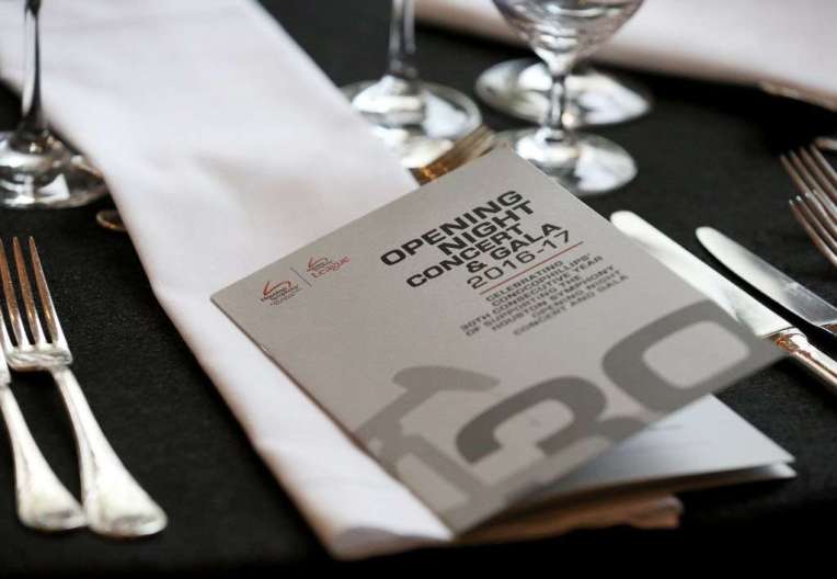
On Saturday 17, 2016, one of my design clients, the Houston Symphony held its major annual event, the Opening Night Gala and was the second most successful ONG event in its history! I worked on the event materials including the Logo, Invitations, Program, and stationery. This year ConocoPhillips was honored for their support of the symphony for 30 years, so the design had a black color palette with matte and shiny surfaces to allude to the oil theme with accents of red referencing the ConocoPhillips logo, and I also used metallic silver to highlight the importance of the sophisticated event.
As for the MOST successful Houston Symphony Opening Night Gala, that was in 2014, for Andres Orozco-Estrada’s Inaugural Performance. I designed the logo of the golden bird leading the flock, with a bright purple and blue color palette to reflect the vibrancy of their new musical director.
Both of my designs have a contemporary yet sophisticated feel to them, so I’m glad that it reflects the modern perspective of my client and their Chairs. Congratulations to the Houston Symphony!
Houston Chronicle article here: http://www.chron.com/life/society/article/Sir-Ben-Kingsley-narrates-the-Houston-Symphony-s-9231920.php#photo-10949702
Spring Street Studios has been home to my art for over 5 years. Tomorrow will be the last Open Studio for me at this restored former warehouse. I’ll miss the fellow artists who have become my friends, the cool old wooden elevator and the great space. After a month of construction delays, next week I’m moving to the Silos, part of the same art studio group, in a building closer Washington Ave. Come by tomorrow between 2-5pm to help me say goodbye to Spring St.
Zaha Hadid dropped by her own exhibition when I went with my architect sister Tania to see it one London morning in 2002 or 2003. Hadid was a rock star in the architect world even back then. My sister was pretty excited to be in the same building with one of her heroes. She obviously also had great presenting skills to convince people to make unusual and expensive buildings! Personally I was disappointed that her work that she called “paintings” in the show was made by her team rather her own hand but seems to be normal for successful artists at a certain point in their careers. Her vision of flowing lines and circular shapes truly shook up architecture.
BBC News: Architect Dame Zaha Hadid dies after heart attack
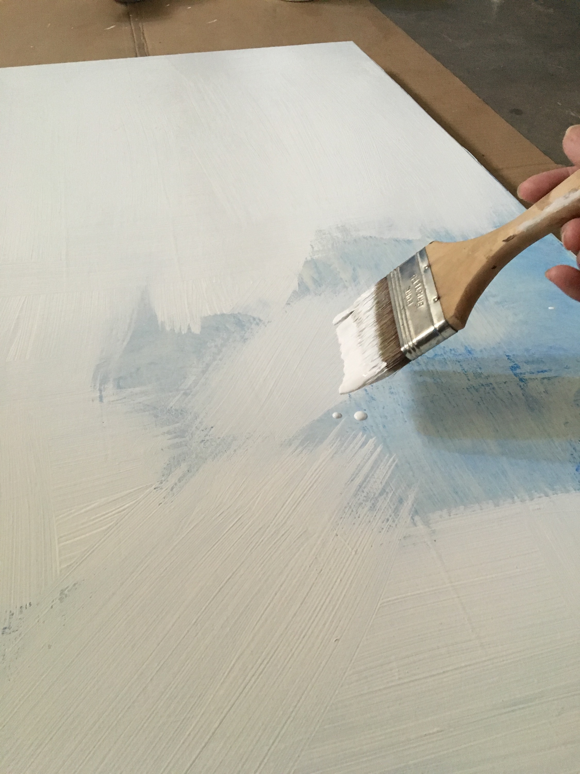 Trying out a different brand of gesso for my next 30″x30″ painting. Good coverage, so far, smooth as white chocolate!
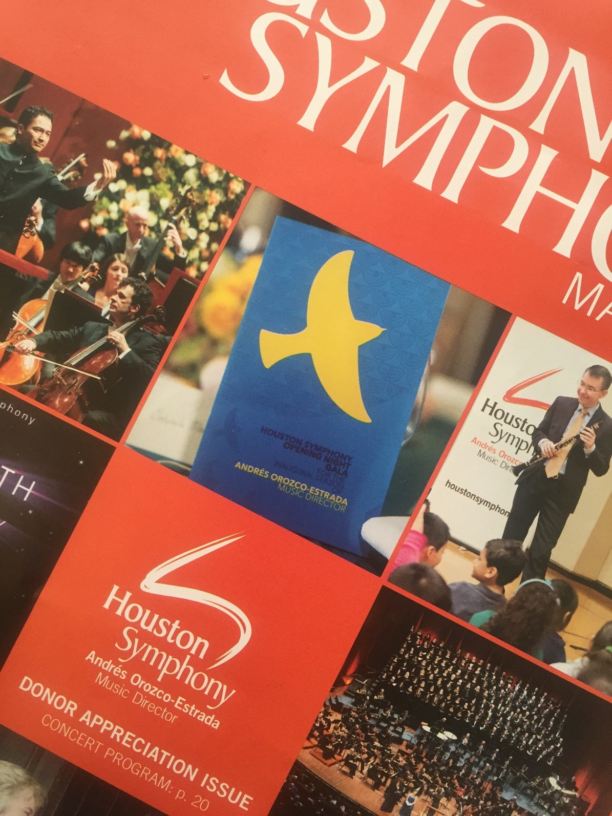
My design & creative concept of Andres Orozco-Estrada as Houston Symphony’s ‘soaring bird’ is on this month’s cover. The vibrant colors and modern shapes celebrates the future. The photograph of the program for the Inaugural Concert & Gala manages to capture the spot-varnished background made up of semicircular patterns derived from the shapes of the sun and moon referencing gold artifacts from the conductor’s native country.
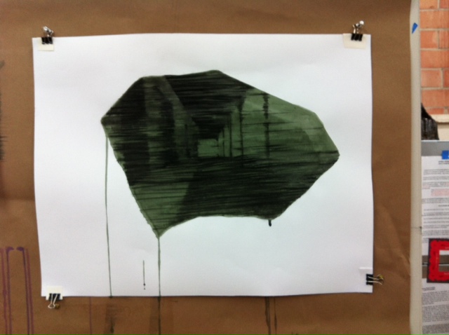
A preview of my new work to be shown this Saturday! Working really hard on ideas, colors, and drawings.
